
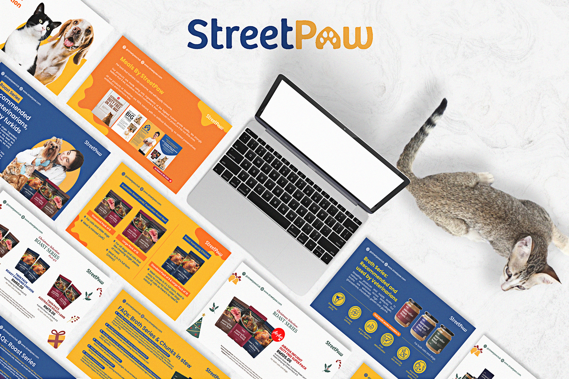
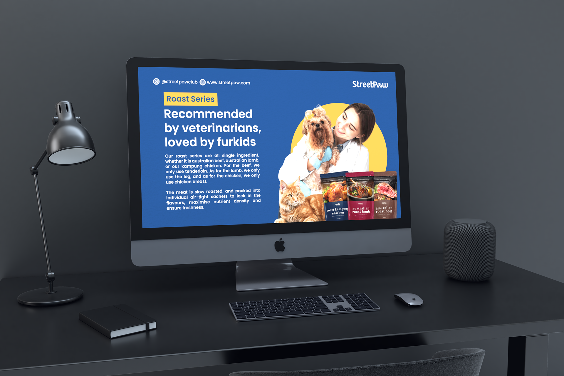
At Streetpaw, the company believe in infusing every aspect of their brand with the same joy and vibrancy that they bring to pets' lives through their premium pet food products. When designing the company deck, we meticulously curated every element to reflect our client commitment to excellence, innovation, and above all, the happiness of pets and their owners.
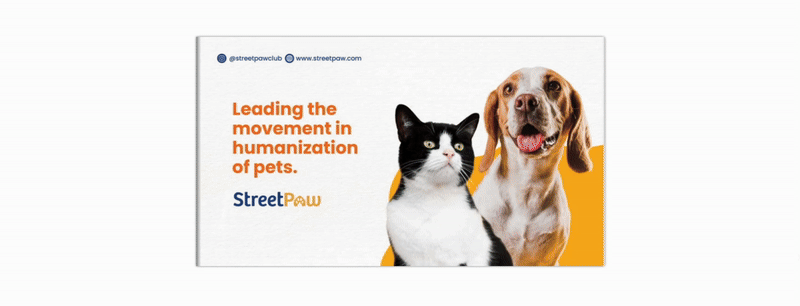
The cornerstone of the design ethos lies in the color palette, drawn directly from Streetpaw's logo - a harmonious blend of sunshine yellow and navy blue. These colors symbolize the warmth and trustworthiness of the brand, evoking feelings of happiness and security. To further accentuate the cheerful ambiance, we incorporated accents of vibrant orange, representing the joyous excitement that pets experience when indulging in our client's treats. This combination not only reflects our client's brand identity but also establishes an immediate emotional connection with the audience.
In selecting typography for our client's company deck, we opted for a blend of modern and approachable fonts. Our headings are rendered in bold, sans-serif typefaces, exuding confidence and professionalism. Meanwhile, our body text is presented in clean, legible fonts, ensuring clarity and ease of comprehension. By striking a balance between sophistication and accessibility, our typography reinforces our brand's personality while facilitating seamless communication with potential client
Digital Version
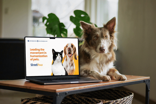
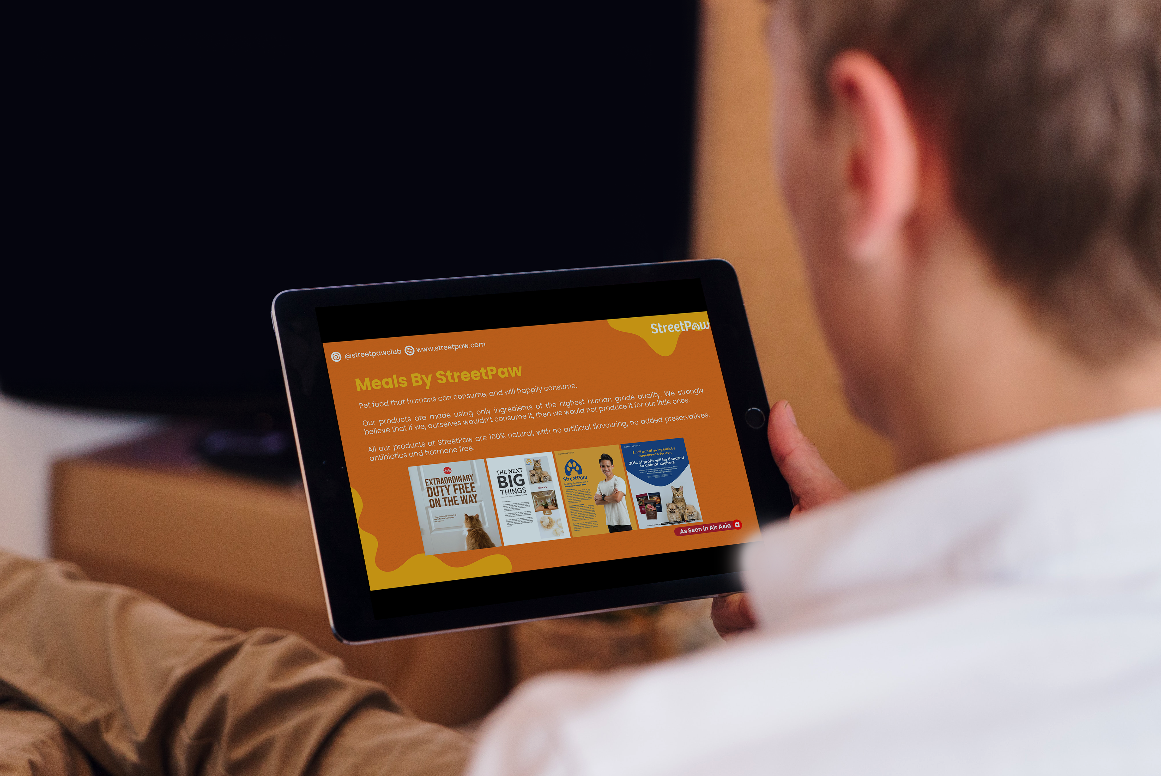
The digital version of the deck, available as PowerPoint slides, PDF, and e-catalogue, offers versatility for viewing on various devices like phones, laptops, and tablets.
Pros include easy accessibility, interactive features in PowerPoint, and compatibility with different operating systems, ensuring widespread reach and engagement. It allows for quick sharing via email or messaging platforms and enables updates without reprinting.
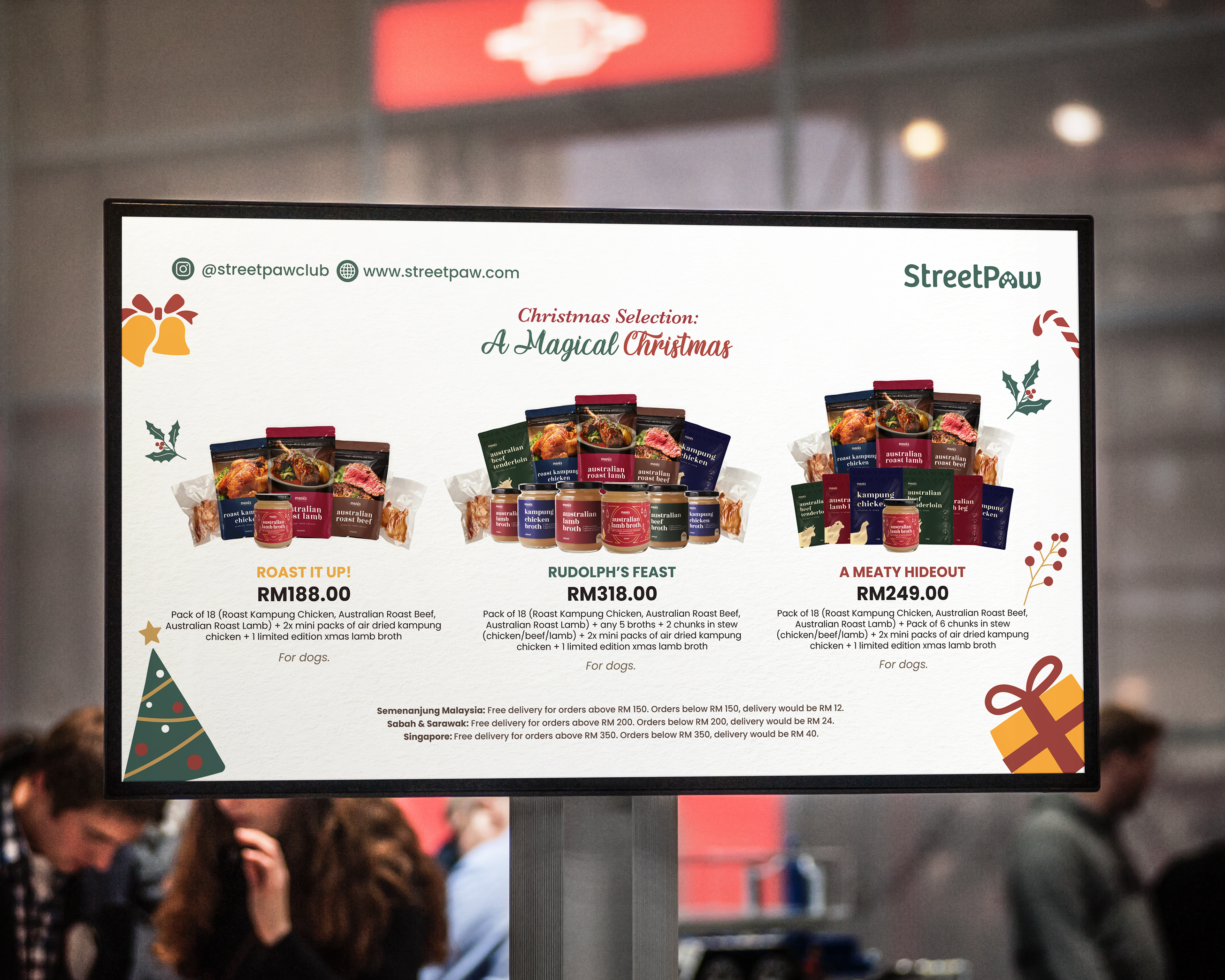
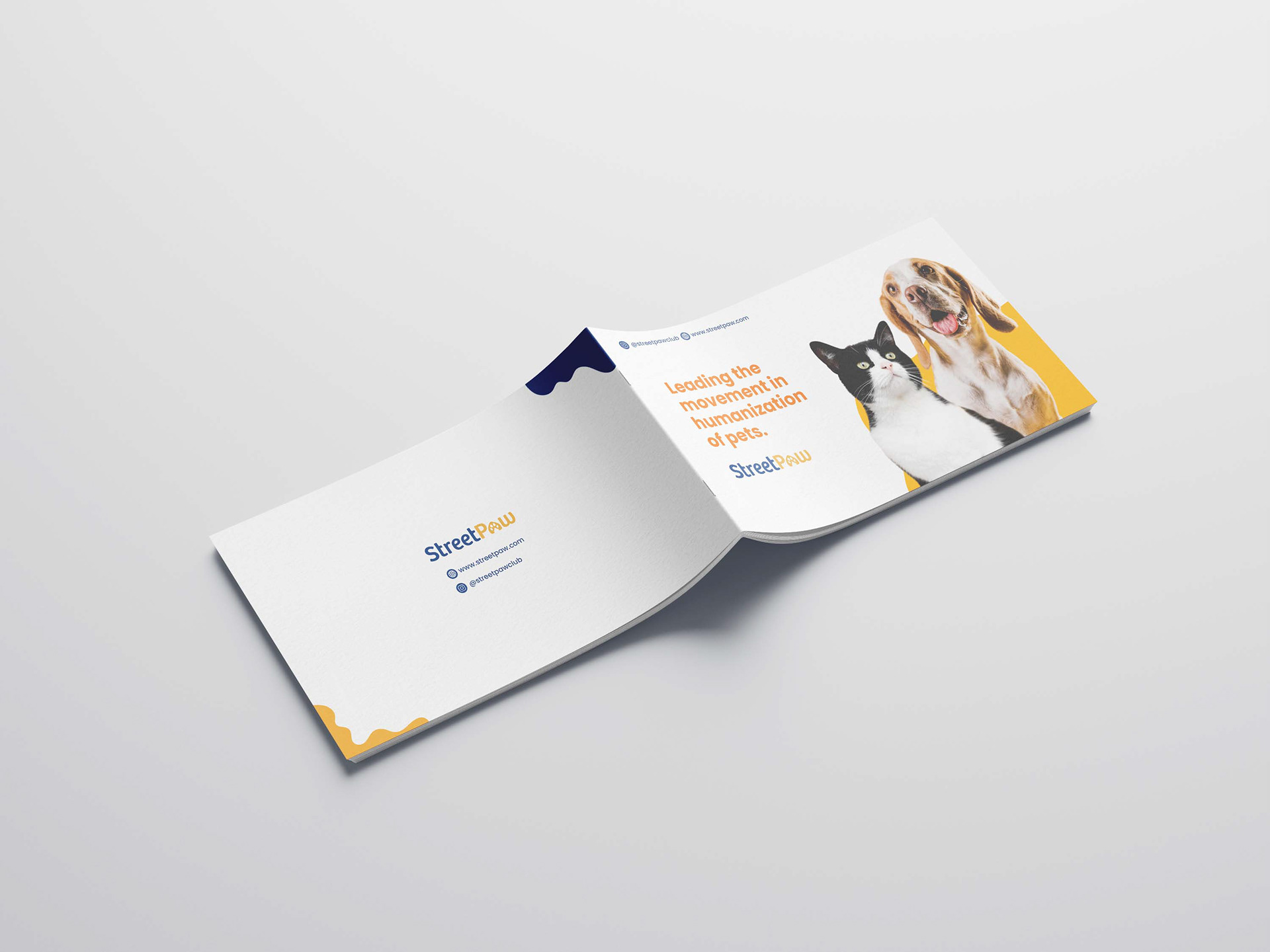
Printed Version
The printed version, presented as a booklet, offers a tangible and professional format for in-person meetings or distribution. Pros include a tactile experience that enhances brand perception, no reliance on technology for presentation, and the ability to leave a lasting impression with potential investors or partners. It serves as a tangible takeaway, fostering a sense of credibility and trustworthiness, particularly in face-to-face interactions.
Our layout is designed with clarity and coherence in mind, ensuring that key information is presented in a logical and engaging manner. Each slide is thoughtfully structured to guide the reader through our client's brand story, product offerings, market insights, and future aspirations. Emphasis is placed on visual hierarchy, with impactful headlines and compelling imagery drawing attention to key messages. Additionally, strategic use of whitespace allows for breathing room, enhancing readability and overall aesthetic appeal.


Above all, our graphic design choices are anchored in maintaining consistency with our client's brand identity. From color palette to typography to imagery, every design element reflects the essence of Streetpaw - a brand dedicated to spreading joy and happiness through wholesome pet nutrition. By ensuring alignment across all visual touchpoints, we reinforce brand recognition and foster trust with potential clients, laying the foundation for long-lasting partnerships built on mutual values and shared goals.
In essence, the company deck serves as a visual testament to the passion, innovation, and unwavering dedication that define Streetpaw. Through thoughtful graphic design choices, we aim to not only inform but also inspire, inviting potential clients to join Streetpaw on a journey fueled by love, laughter, and the boundless joy of pet companionship.